
NORVIC is strengthening its position as an international and innovative ship operator in the dry bulk and tanker markets. Established in 2006 the company has experienced rapid growth by bringing an alternative, agile approach to delivering shipping services.
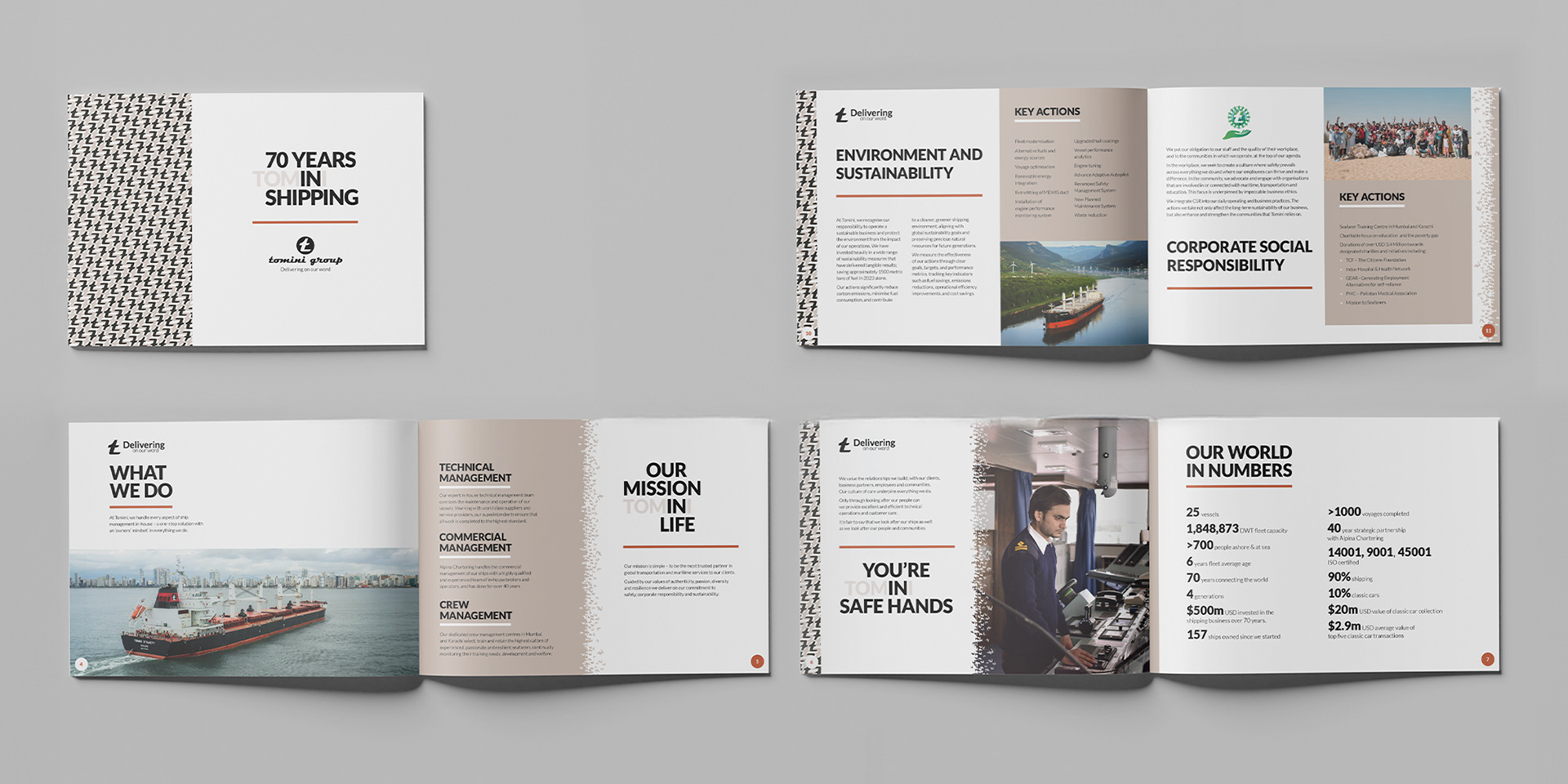
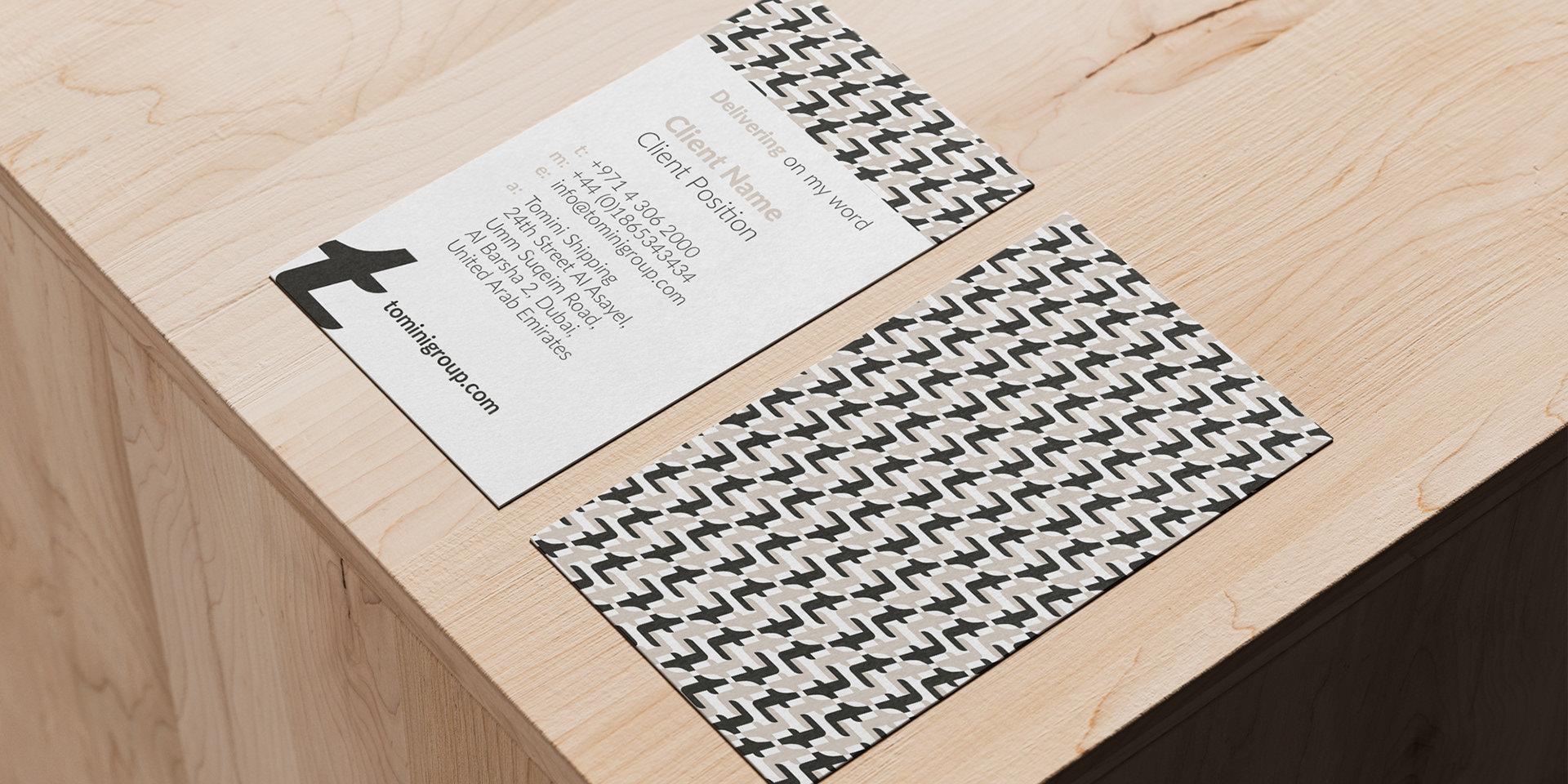
Rebranding Tomini Shipping – The tomini 't' is iconic to the curent brand look and feel. We took this and created a pattern that delivers a timeless feel to it. This is adaptable and used across all forms of communications and media. From the back of business cards, to wallpaper in the office, and printed onto silk scarves. We didn't set out to make a pattern, it evolved naturally and happily

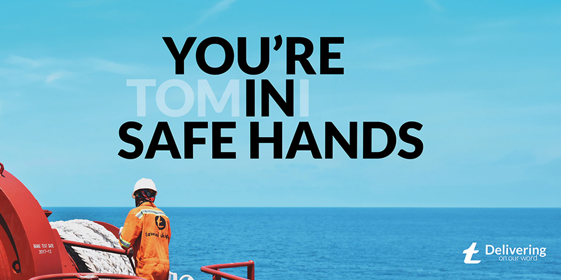
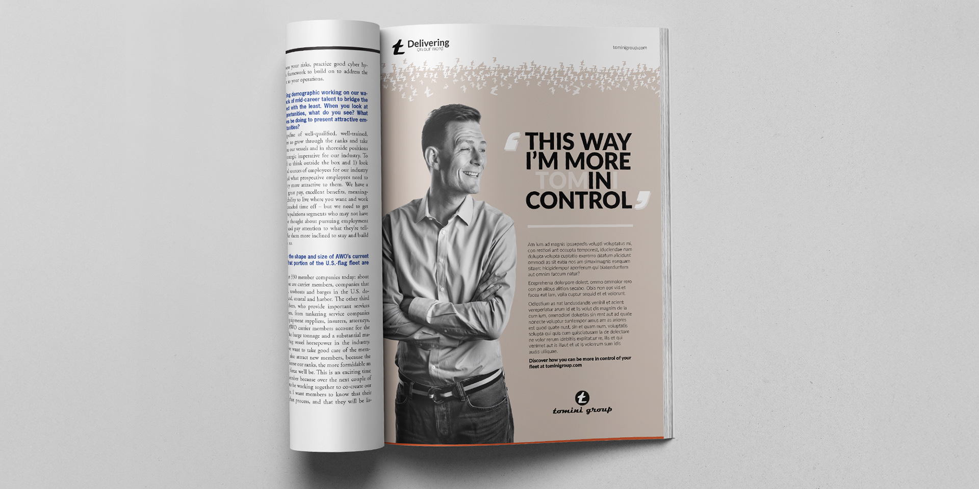
Headlines and copy-led concept – using the 'IN' in Tom'in'i within the headlines was a branding exercise in itself. Effortlessly branding Tomini in all of its communications, on and offline.
24 page Brochure – 70 years in shipping. This clearly shows how we are introducing the pattern inline with the headline style above
Stationary – Business cards, letterheads, powerpoint and email
Case studies – Print and digital messaging. Used in recruitment
Headlines – text goes here
